Here is a link to the infographic: Covid-19 survival rates based on the hardest hit city in the world.
Addtional notes
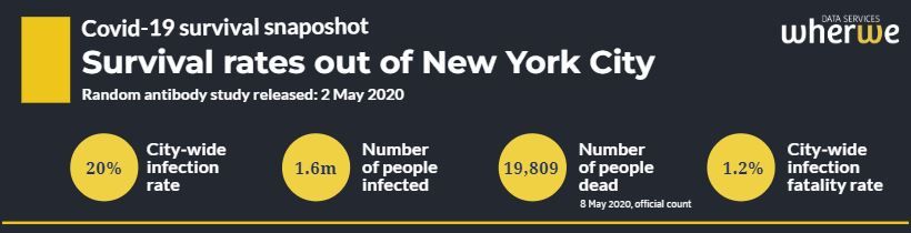
- In the infographic, all sources are fully referenced and the calculation methodology is explained in the footnotes. Most importantly, it uses official New York State government data on the health and age profile of all Covid deaths (taken on 8 May 2020), as well as the 15,000-person random antibody study (released on 2 May 2020).
- The results regarding demographic and health splits are already becoming mainstream. They are confirmed in multiple studies and reports from China, Italy and other locals.
- The study focuses on New York. It does not attempt to derive a "world-wide" infection fatality rate. The New York City city-wide fatality rate is on the high-end of what is being observed from random testing studies in other parts of the world. We will be publishing an article on this shortly.
- Note, we cannot include additional deaths that have occurred since the beginning of May without also including additional infections. While deaths would have continued to increase since the beginning of May (which we can track), so will have infections (which we cannot track scientifically without a random testing study). A neutral expectation would be that the fatality rates would remain largely unchanged. If and when a new random testing study is conducted and released, we will update the snapshot.
- Note finally we took the total death count as of 8 May 2020. Arguably, we should have taken deaths on the 2 May 2020, the same date the random study was released. That would have decreased the overall infection fatality rate from 1.2% to 1.1%.
If you have any questions or comments, you can use the comment section below, or you can email the main author directly at rob@wherwe.com.